Perspectives: Cincy Art Festival—Spring 2026
C&CD was a professional course exploring how marketing gives design a purpose. At the end of this course, we created a final project with the goal of bringing together all aspects and learning objectives from the semester.
My final project consisted of creating a visual identity & branding for a conceptual art festival in the Greater Cincinnati area. This festival would be centered around uplifting local artists and showcasing their work in a creative environment. Giving these small artists an opportunity to sell their works, and to build the local creative community.
FESTIVAL IDENTITY
To begin the project, I came up with a few overall goals for the festival’s branding based on research of other local art festivals. I decided I wanted the look to convey a fun and inviting event, open to all creative minds. I would do this through use of vibrant colors, artistic and eye-catching imagery, and unique textures.
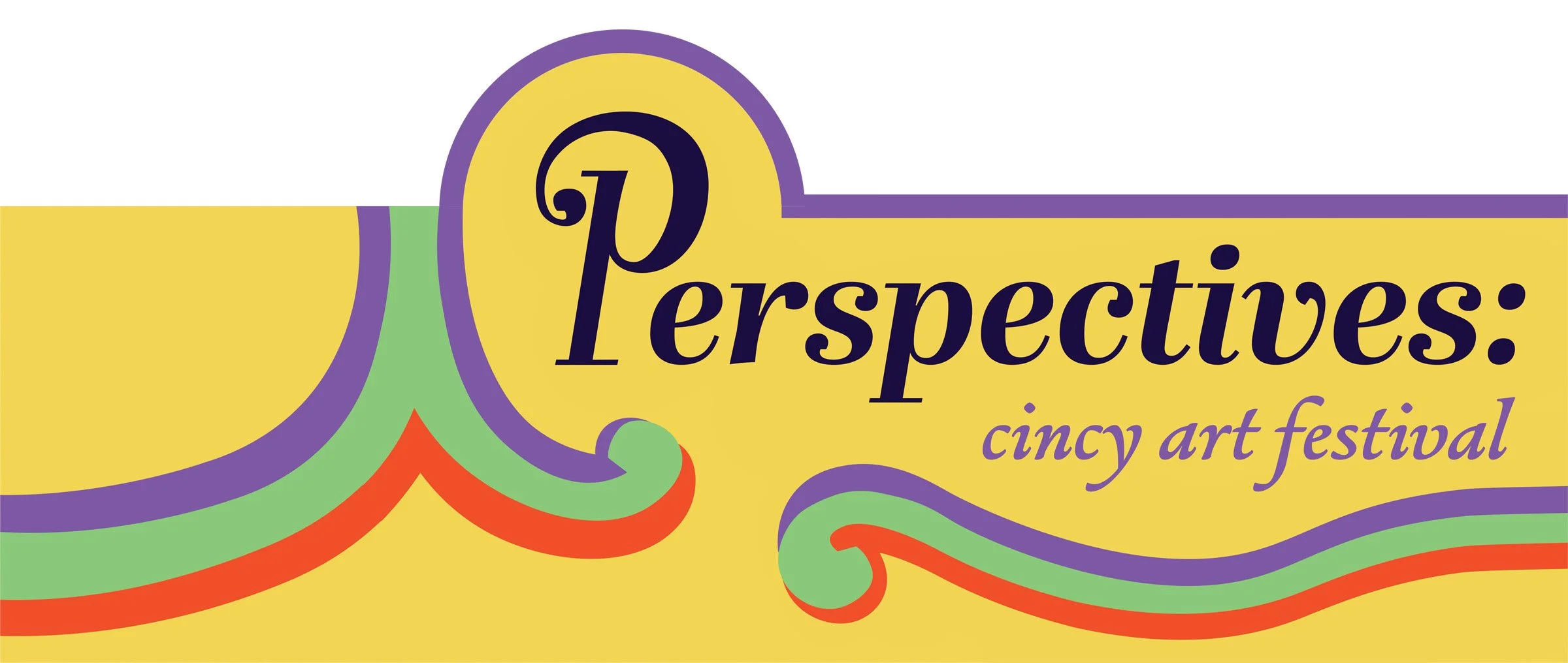
With the overall tone of the event decided, I moved on to deciding a name for the event. After considering a few, I landed on “Perspectives: Cincy Art Festival” due to the connections it has with the diversity of the event. This name emphasizes how people with a variety of different backgrounds and artistic talents will be at this event, showing different perspectives on different art forms and the ways they are created.
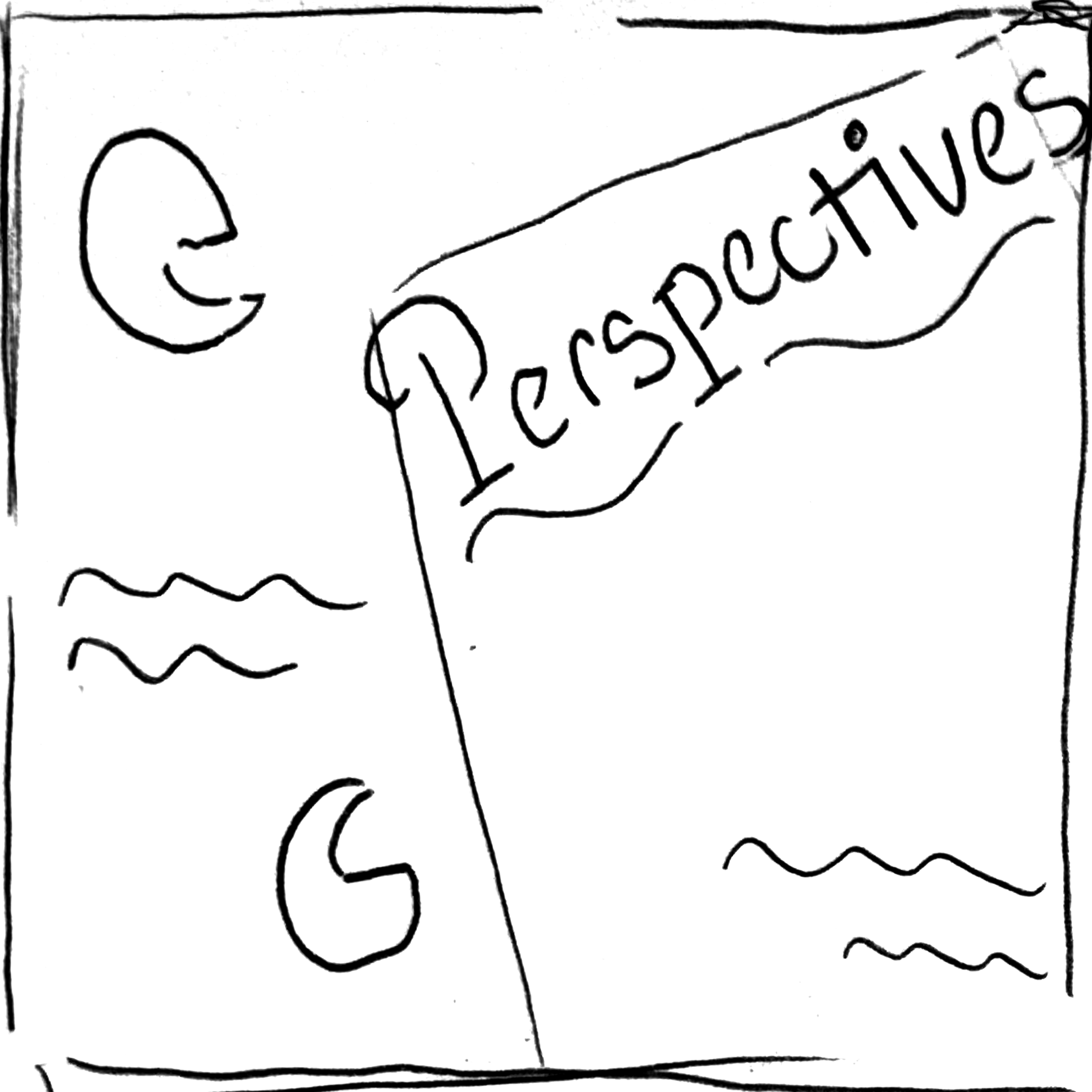
WORDMARK PROCESS
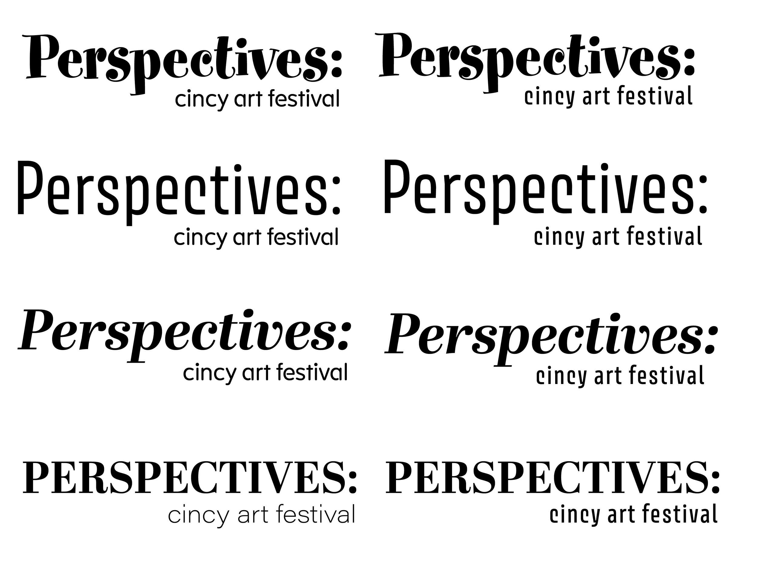
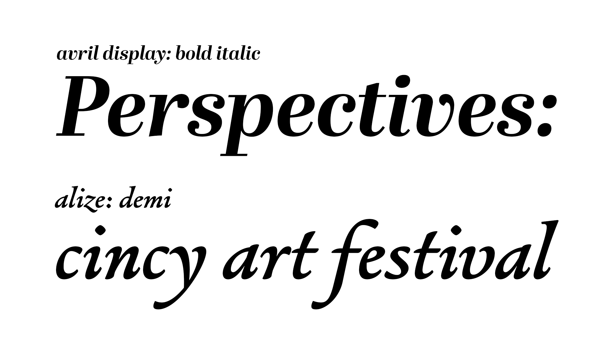
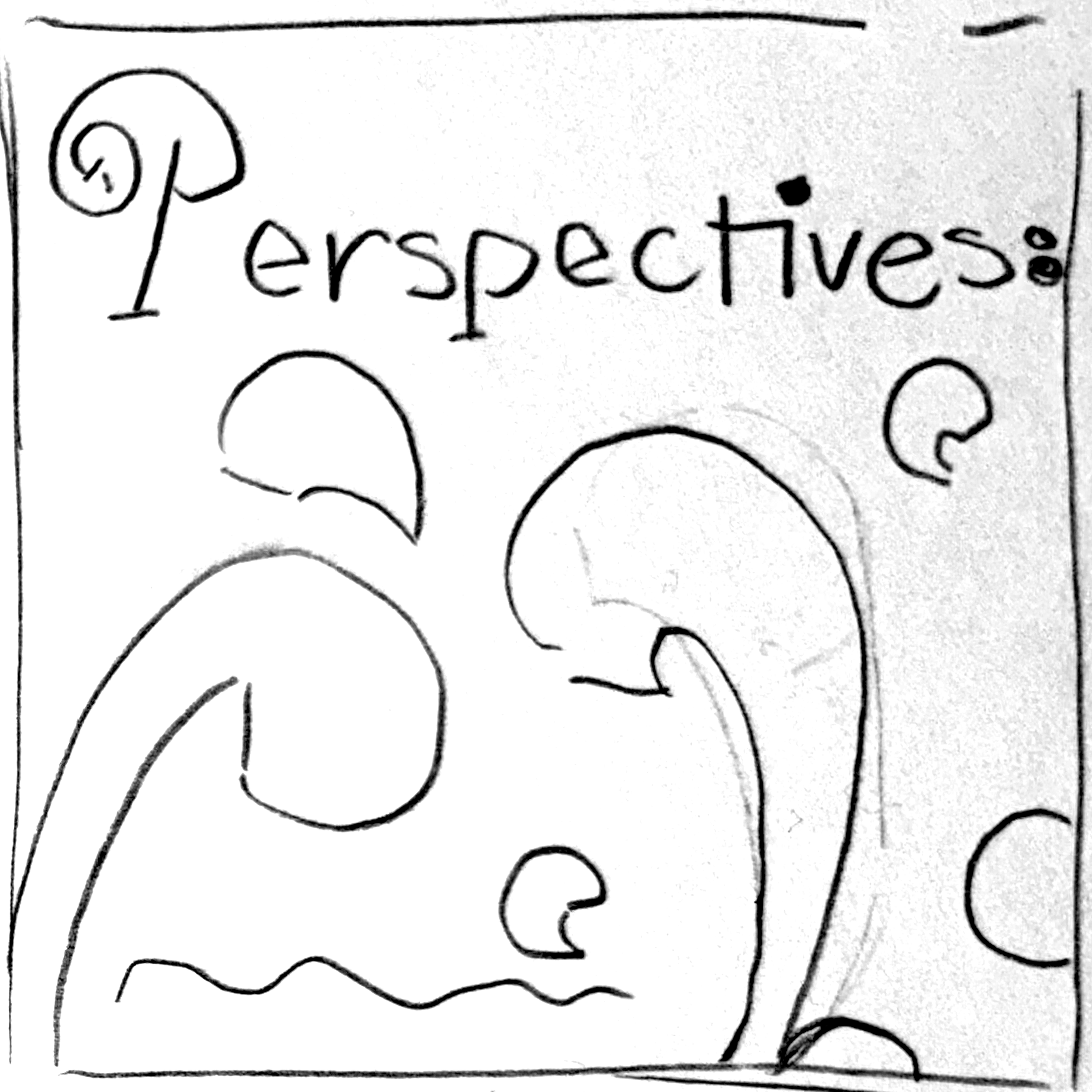
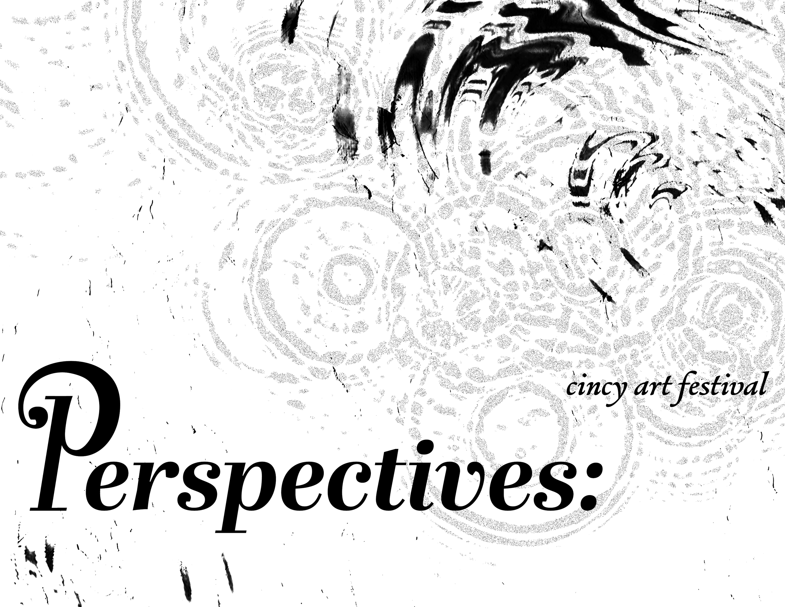
First, to create a distinct wordmark for this brand, I started with typeface pairing explorations, and eventually landed with my final typefaces. I decided on these two typefaces due to the dynamic forms within the typeface, the contrast creates a natural flow that feels creative and bold.
Due to the long name of this brand, having a full wordmark as well as a shorthand version would allow for broader application of this logo. I kept this in mind throughout my sketching process, wanting to emphasize the first “P” in the word.
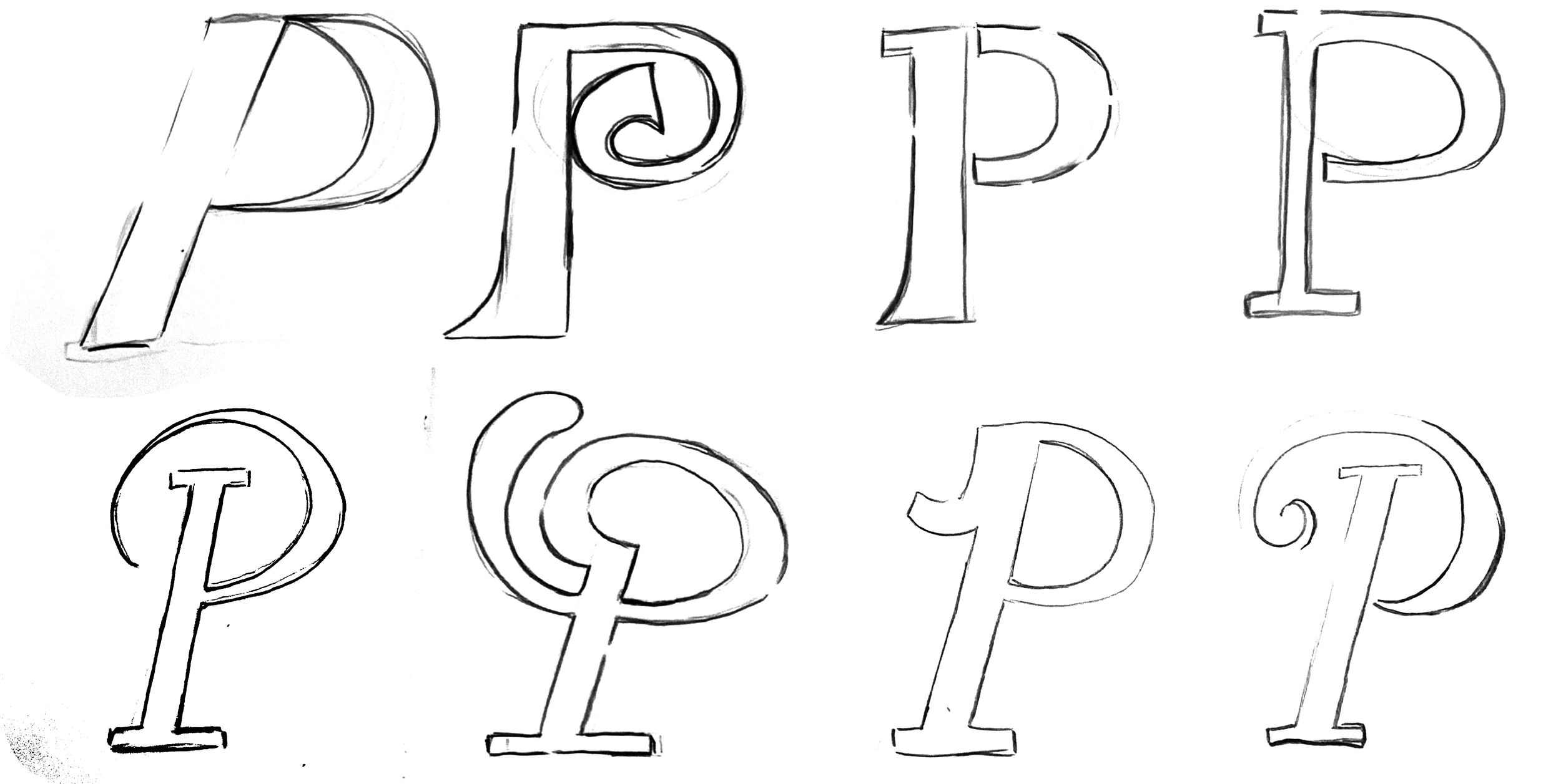
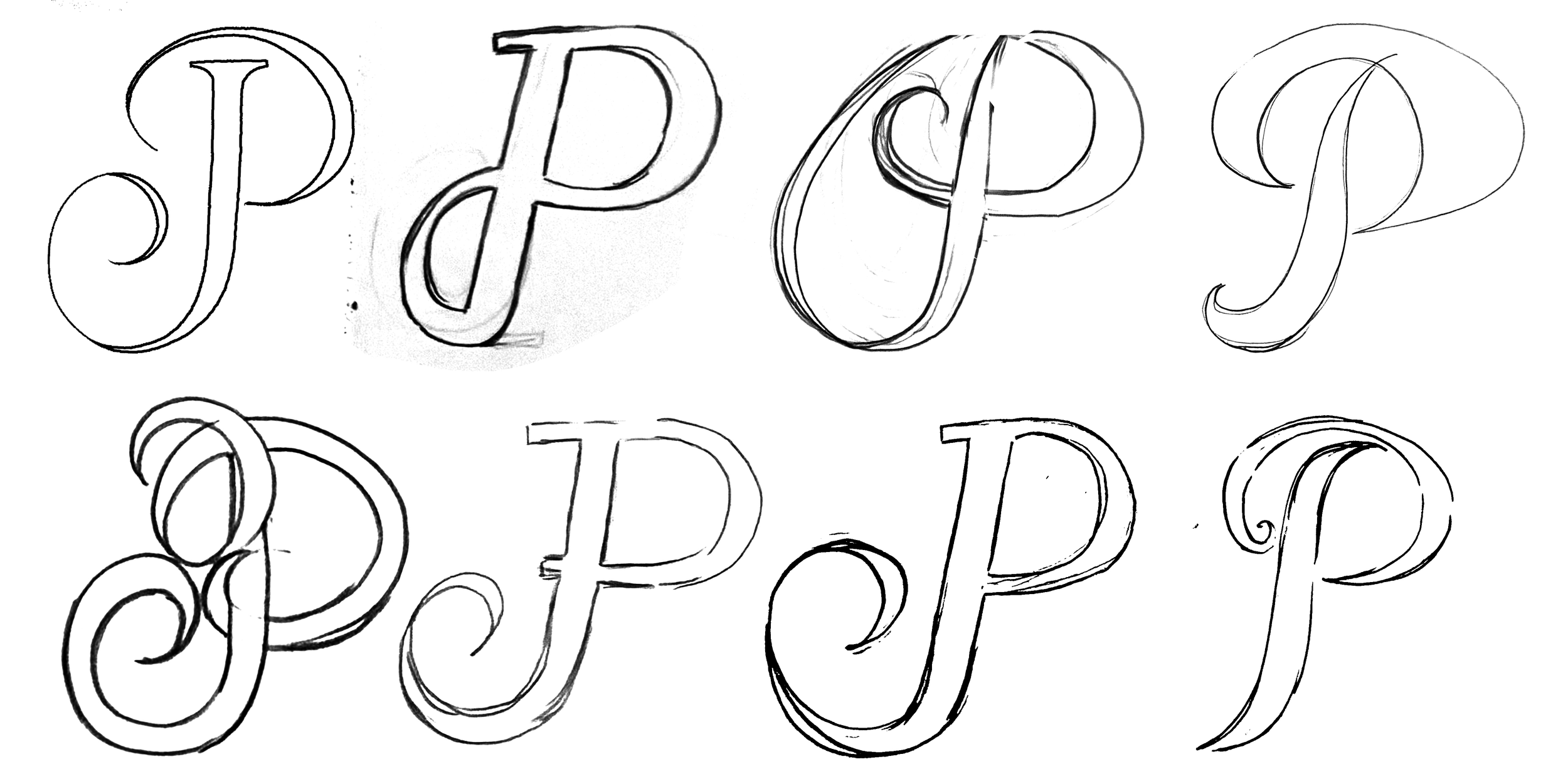
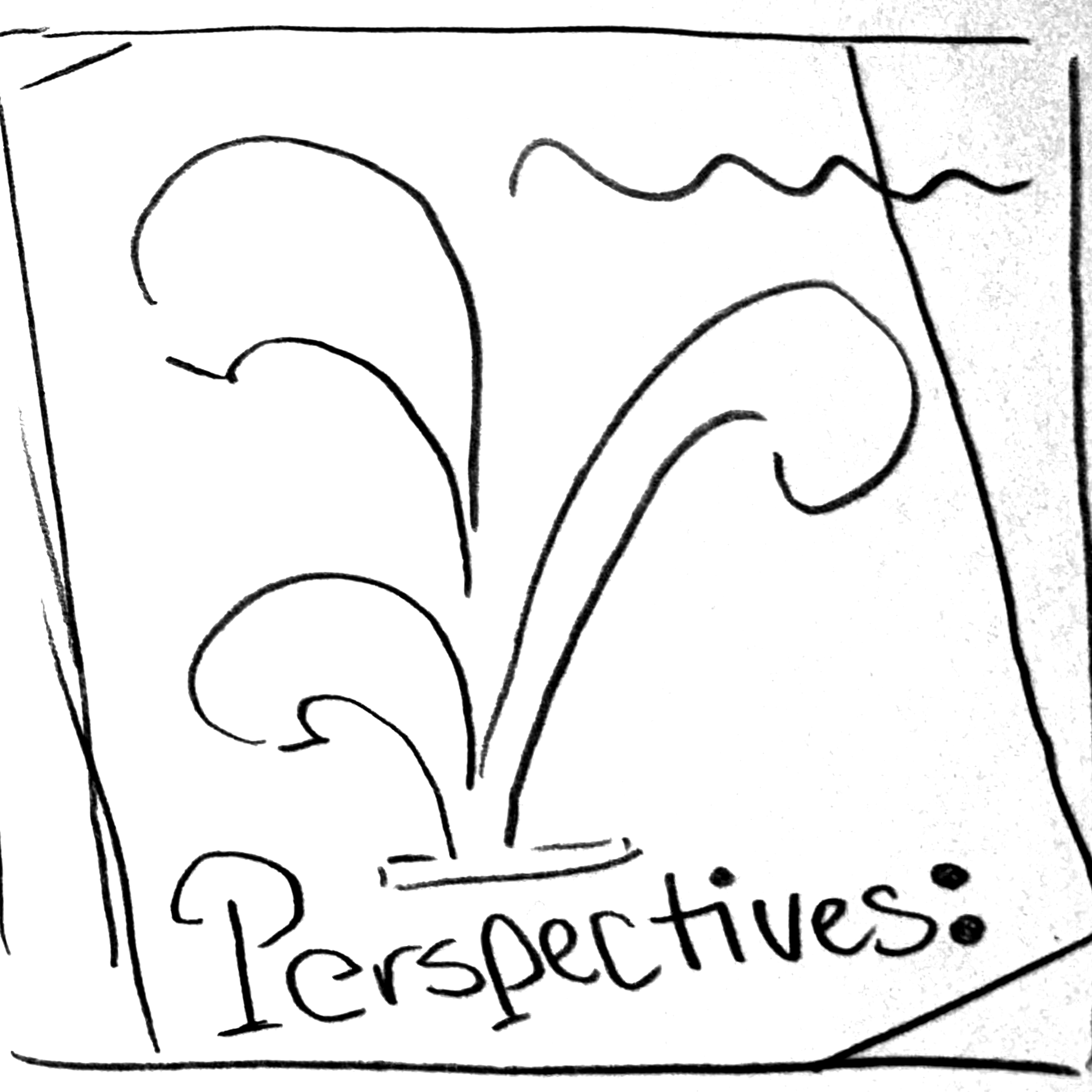
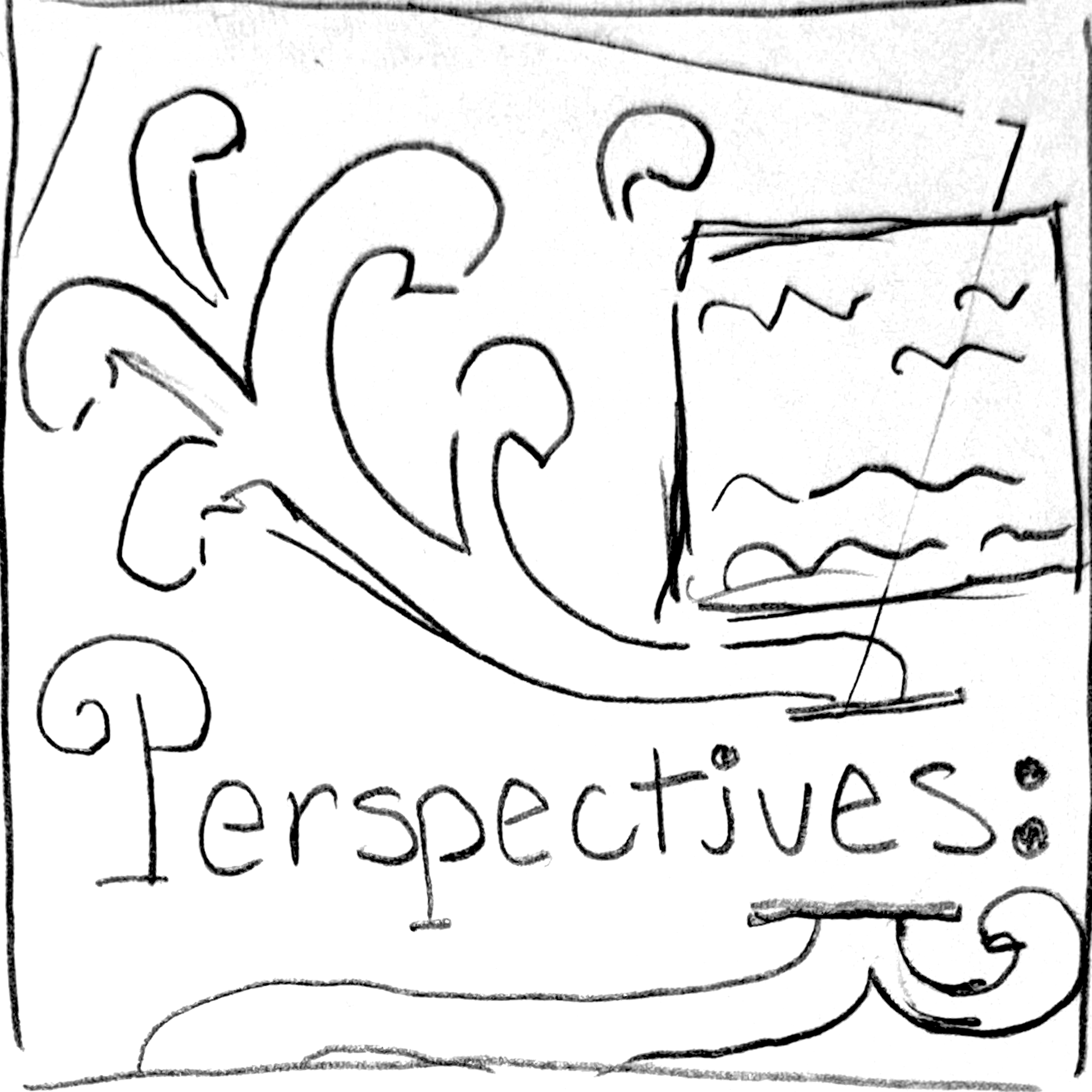
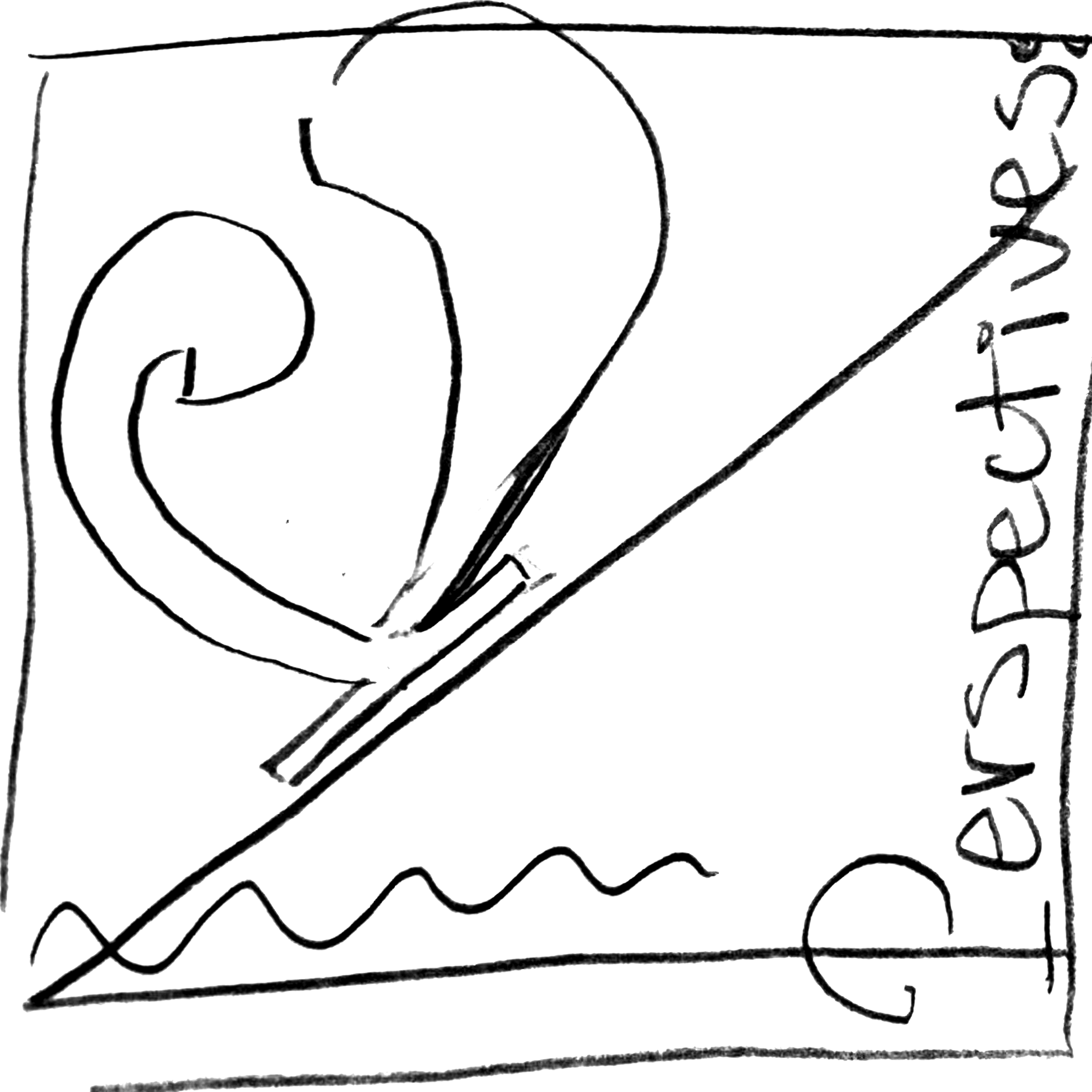
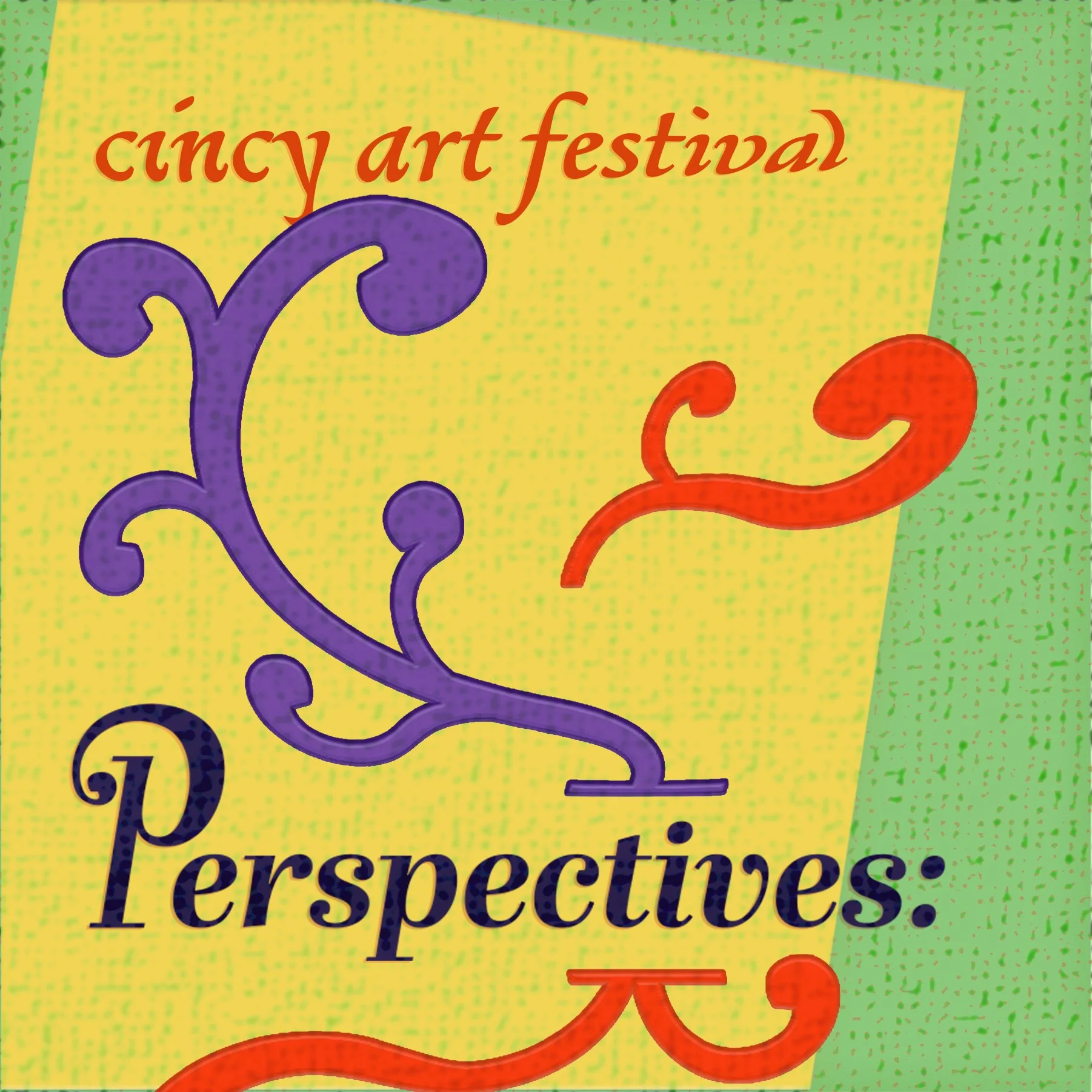
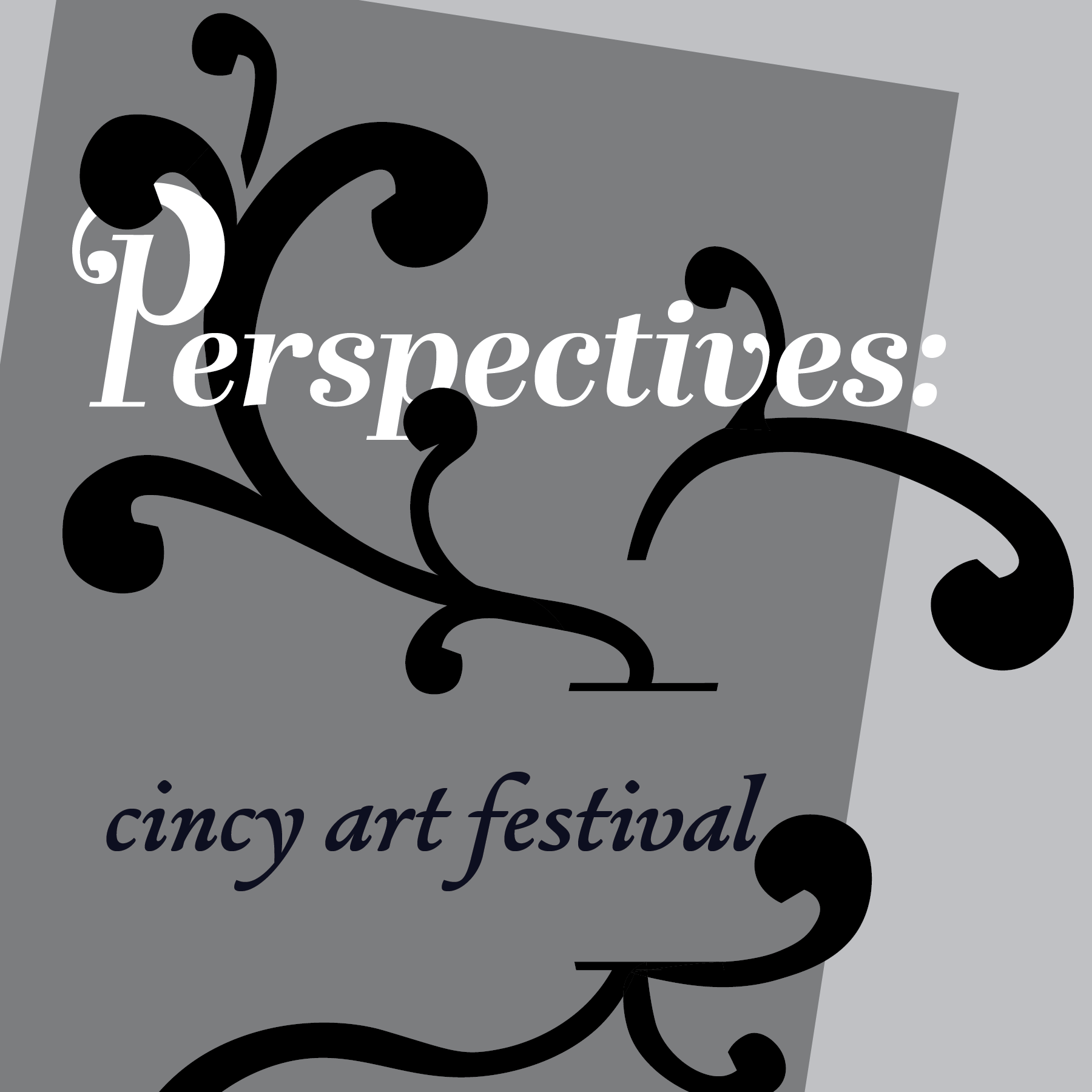
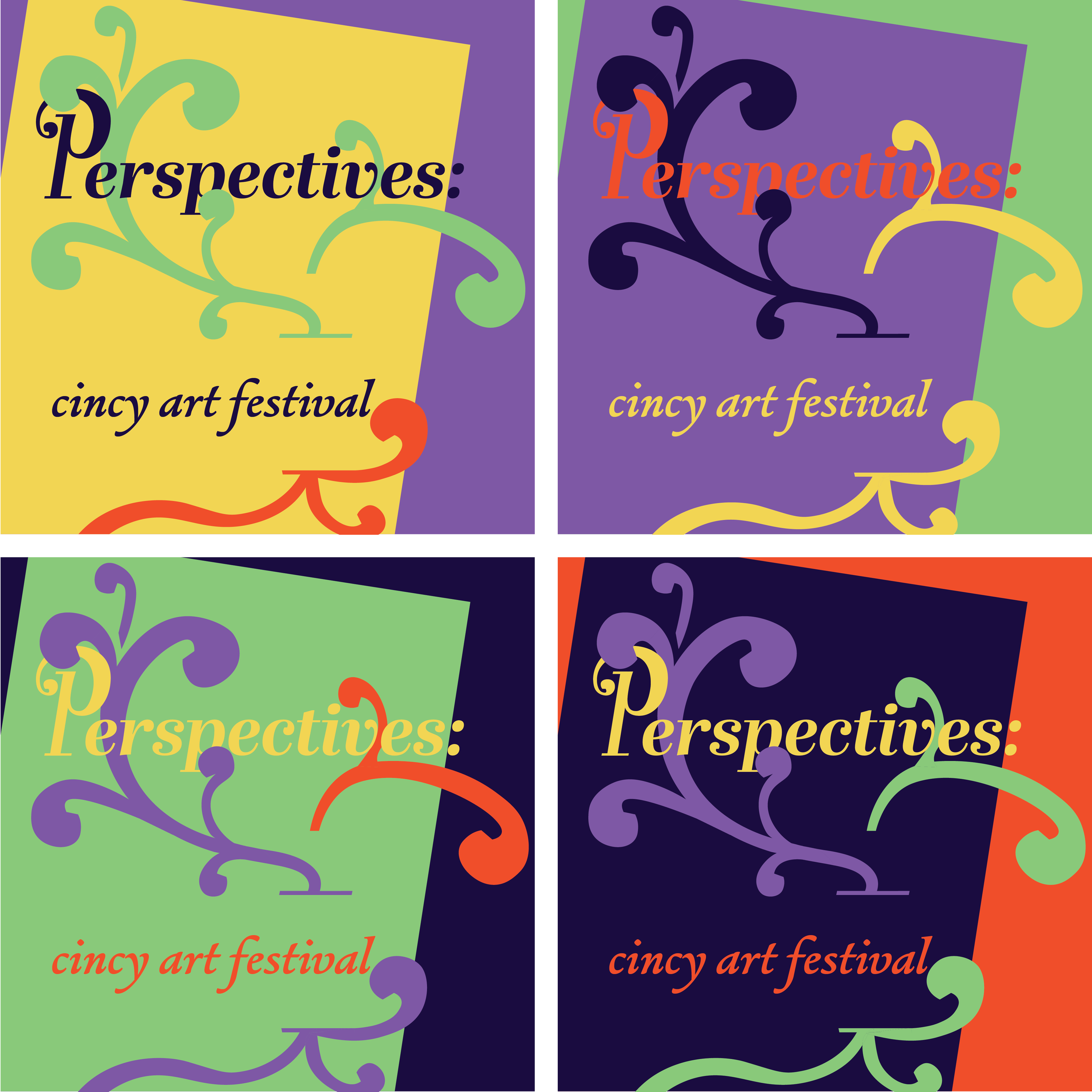
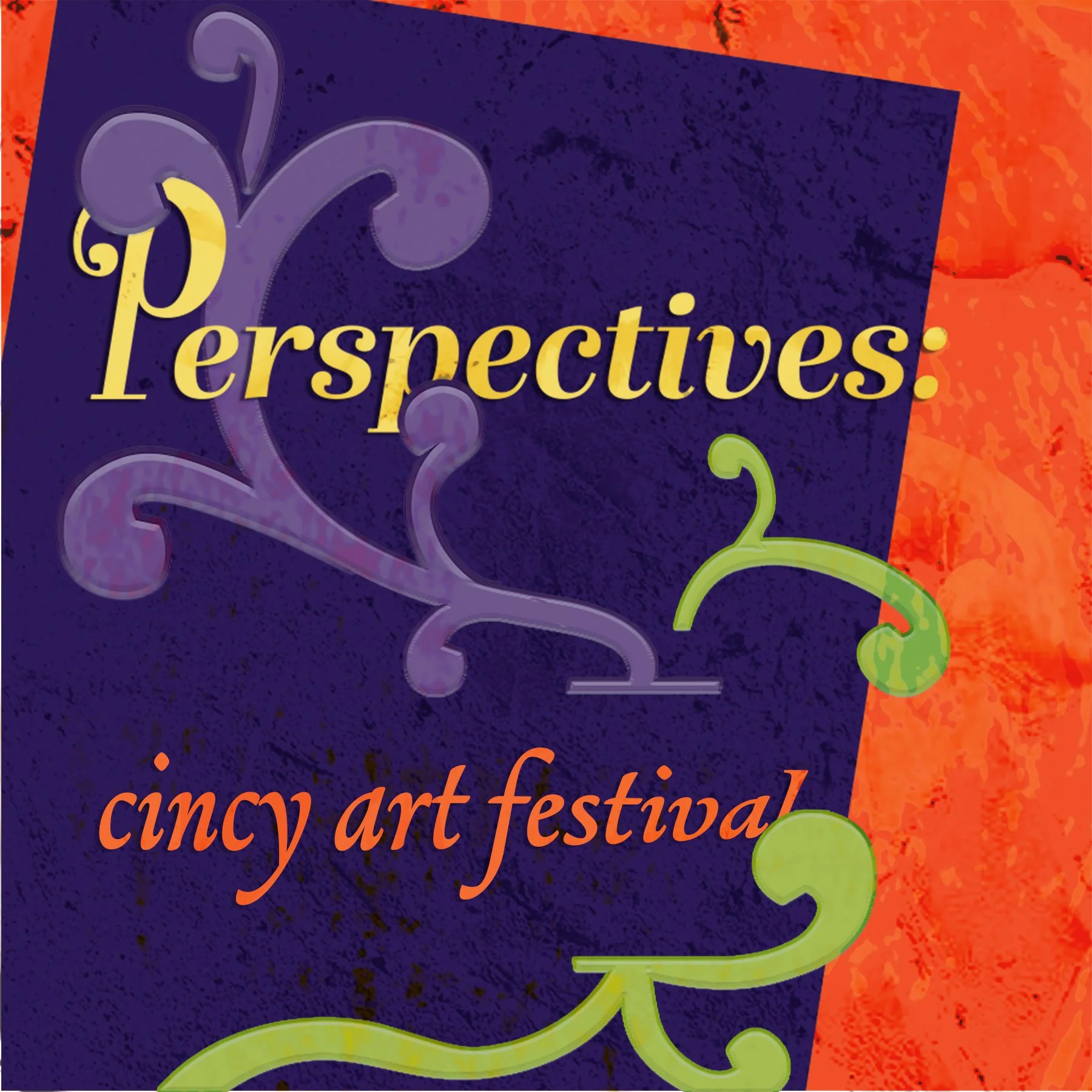
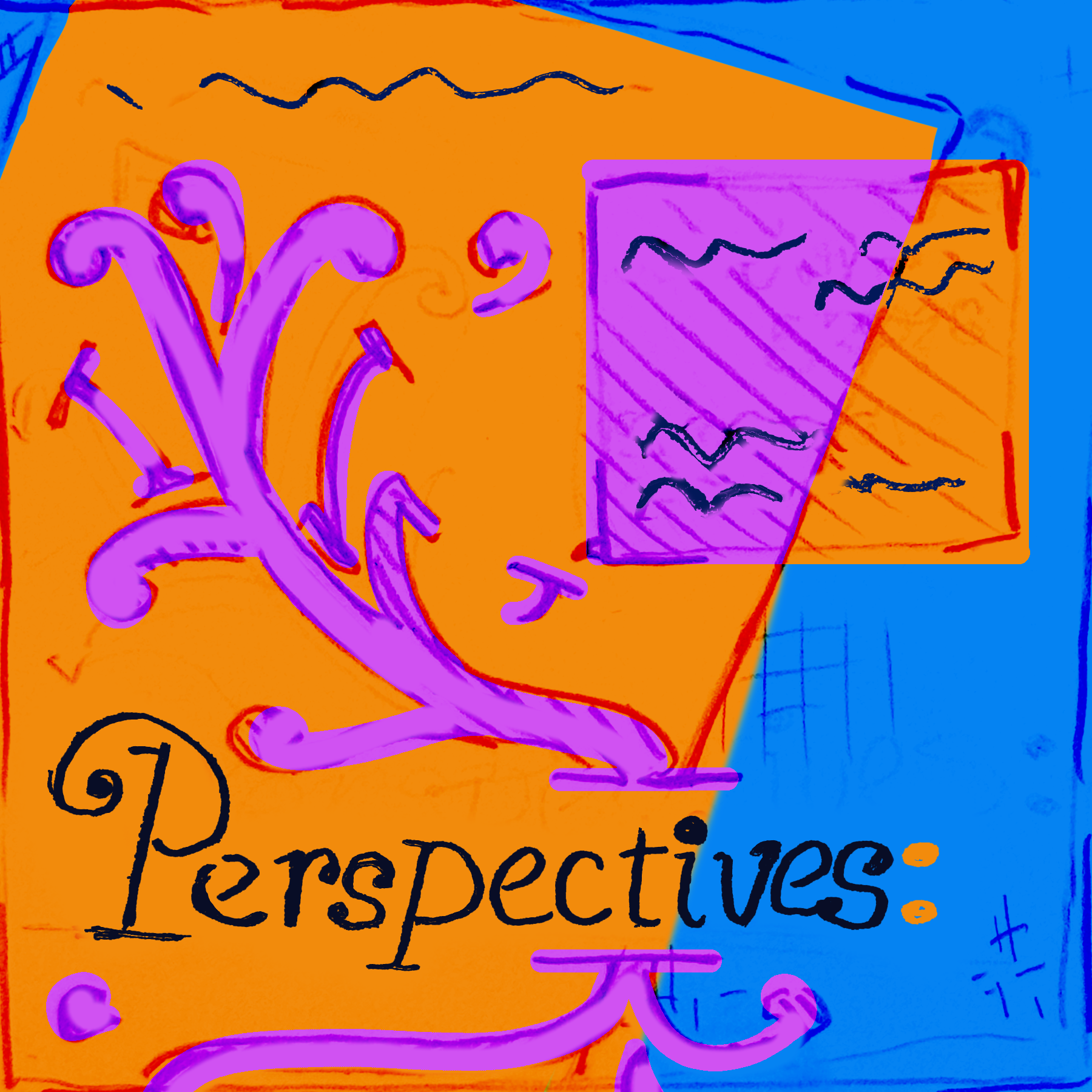
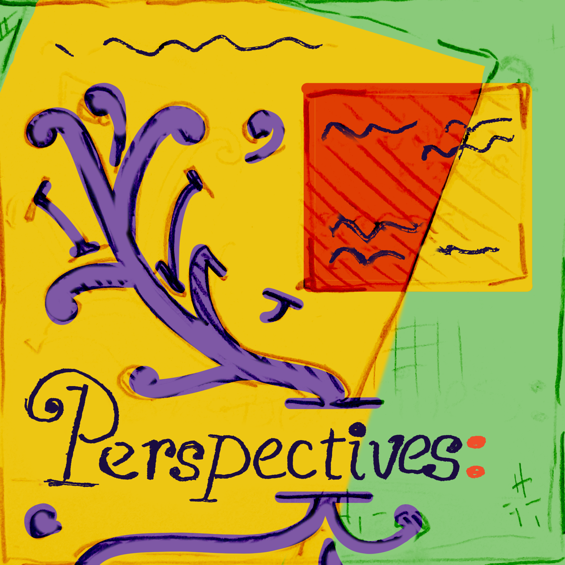
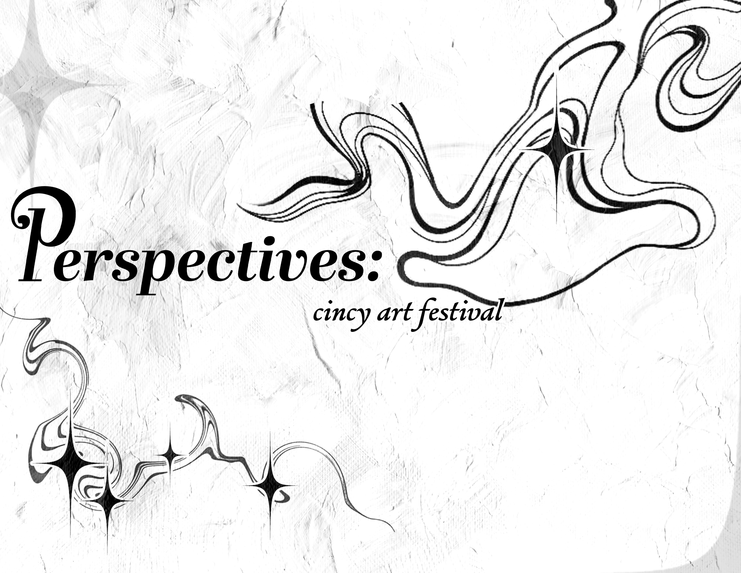
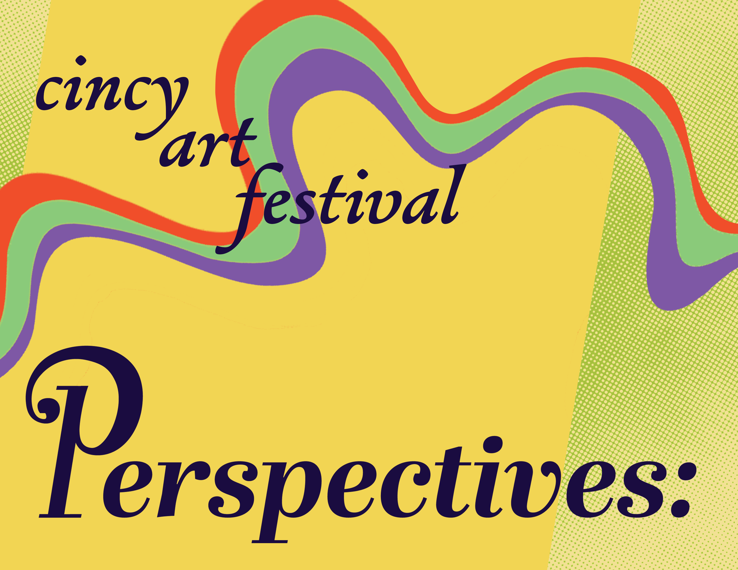
After the exploration through sketches, I decided on a direction. During revisions, I decided to use a bold version of the typeface, to better match the energy at this festival. I also decided to incorporate aspects of the typeface’s form language in the details of the stylized “P” to bring more unity.
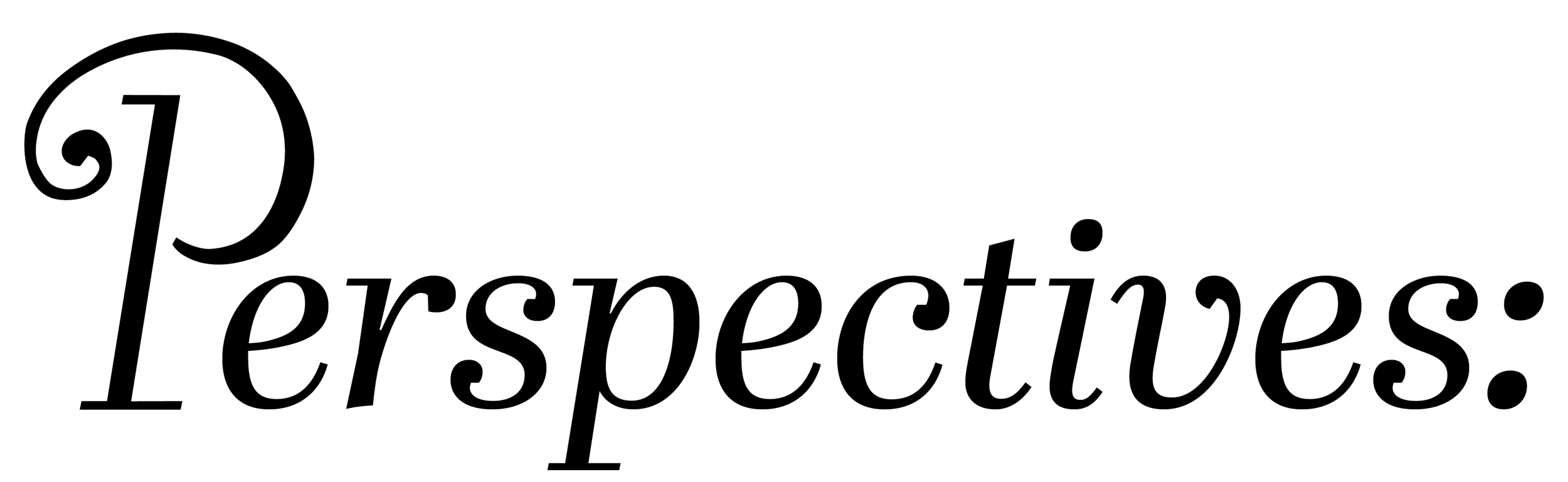
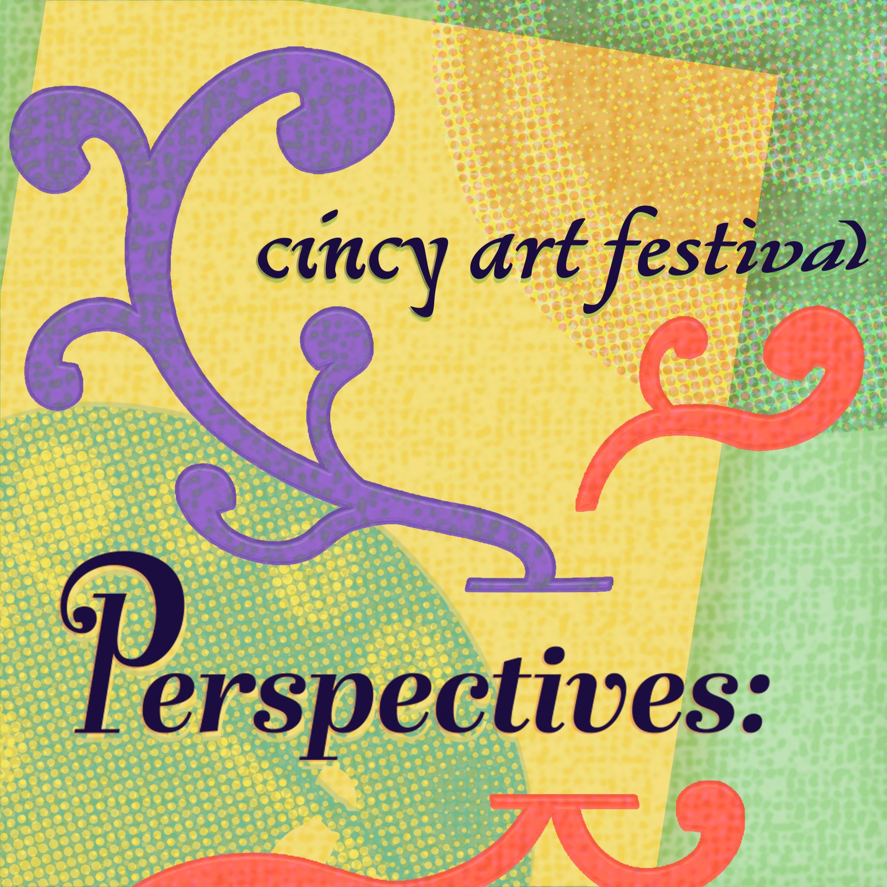
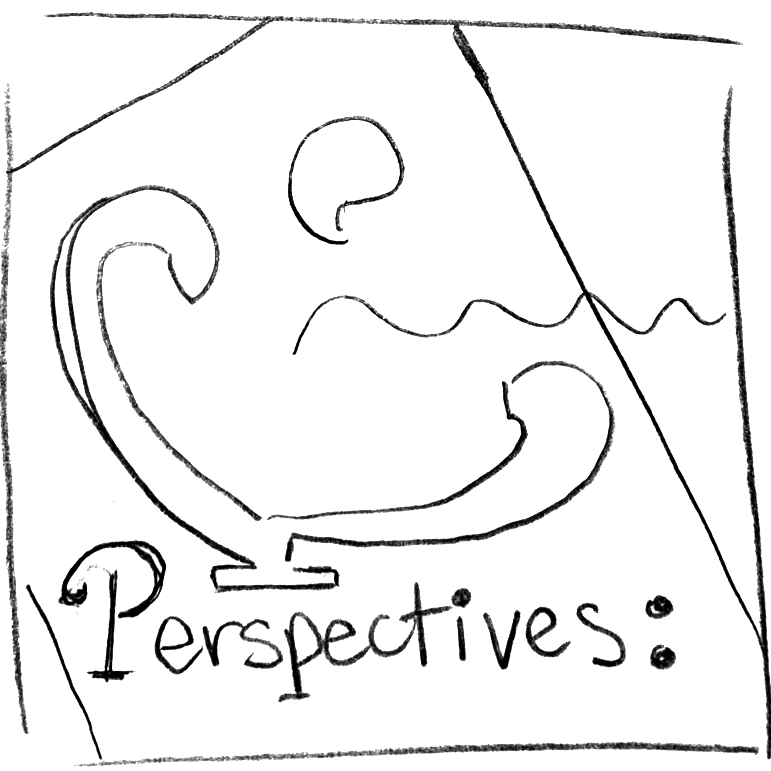
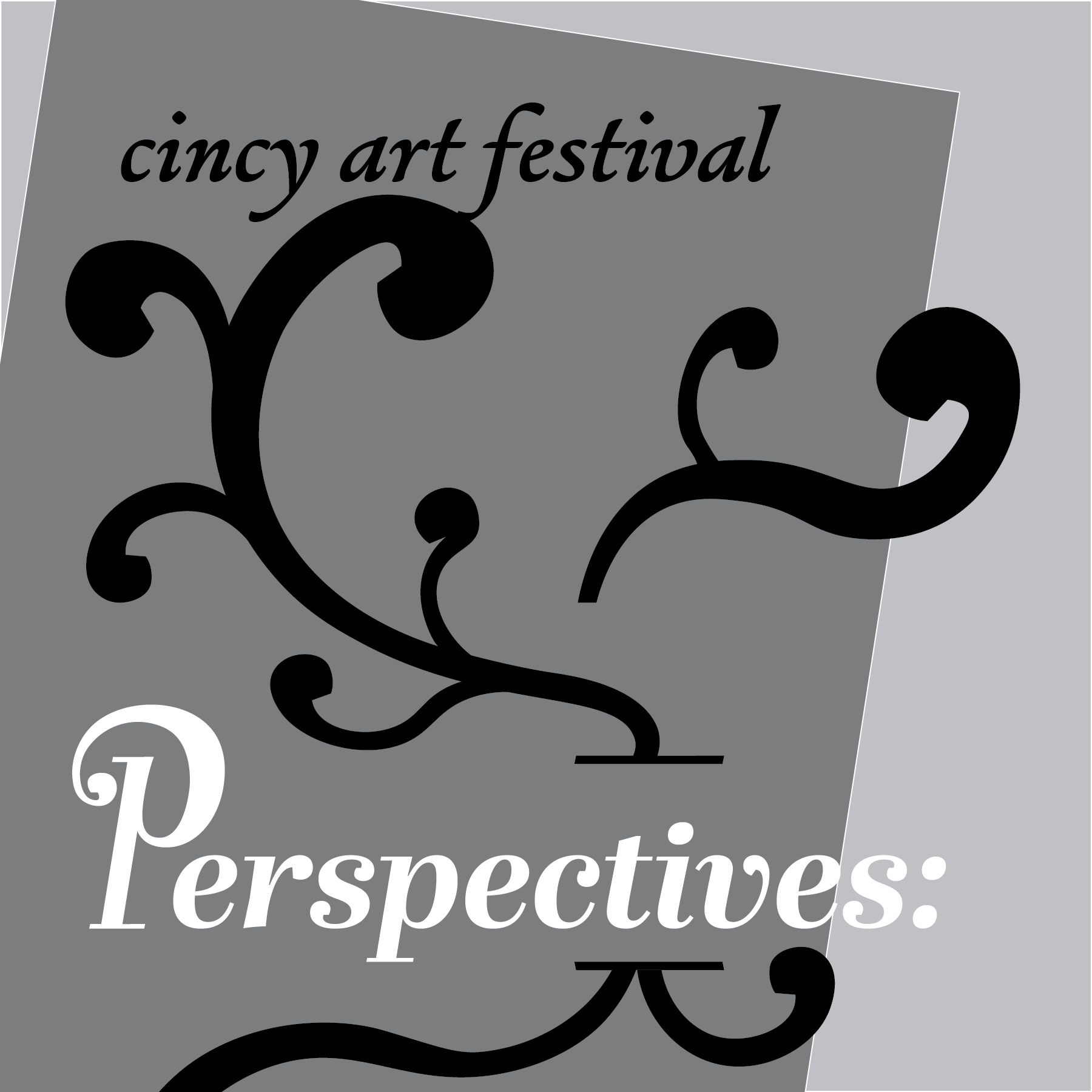
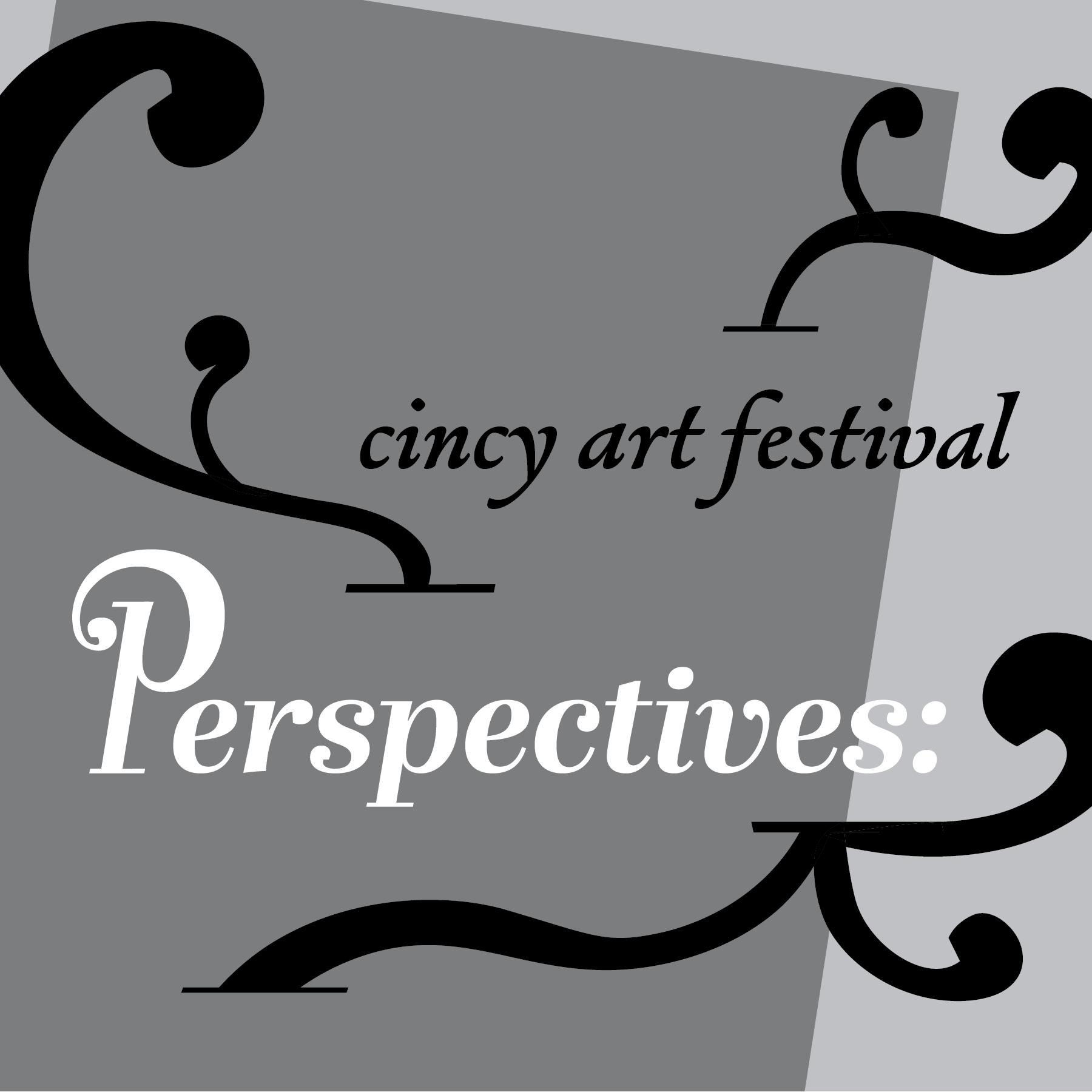
FINAL WORDMARK
After the exploration through sketches, I decided on a direction. During revisions, I decided to use a bold version of the typeface, to better match the energy at this festival. I also decided to incorporate aspects of the typeface’s form language in the details of the stylized “P” to bring more unity.
SOCIAL MEDIA APPLICATIONS
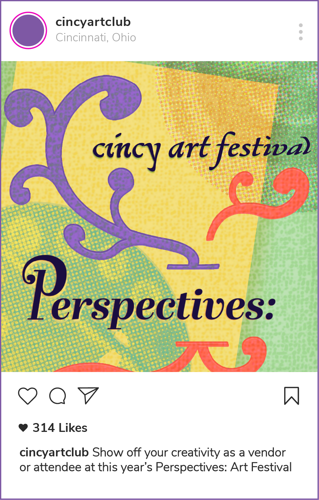
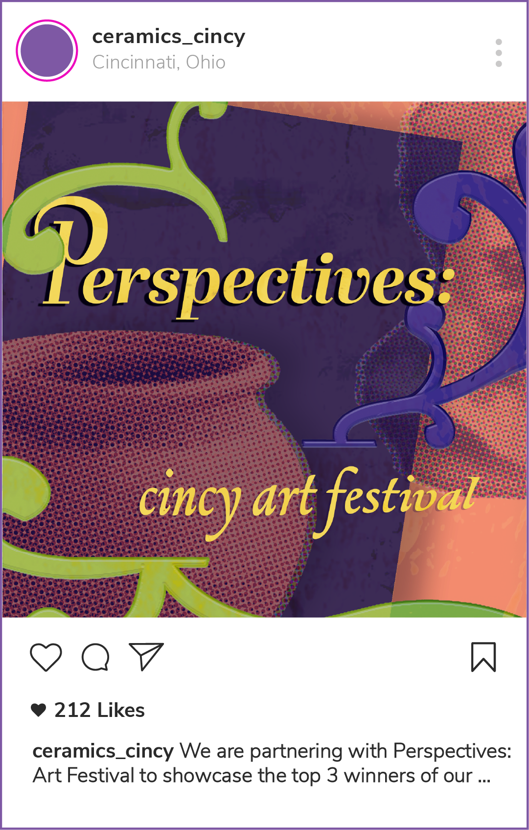
Through three social media posts, I hoped to reach different groups from my target audience. I started with a few general sketches of some visual system possibilities, knowing I wanted to use the same form language from the typeface that I included in the wordmark.
Next, I took the compositions into illustrator and made three initial compositions to explore the positioning of each shape and the text. I wanted each image to feel unique, while also feeling within the same visual family.
Composition 1: Fine Arts
Composition 2: 3D Mediums
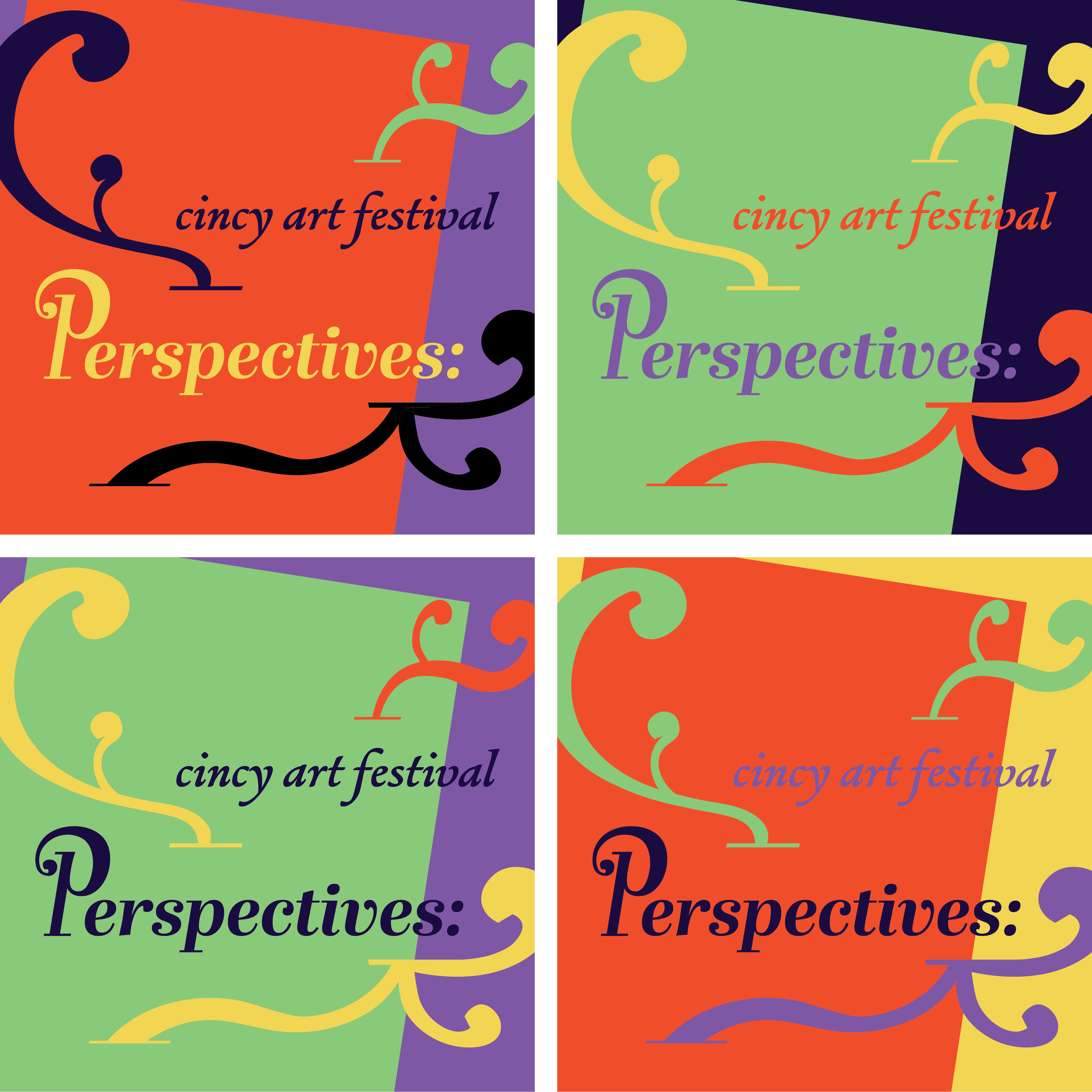
After finishing a general composition for each social media post, I explored color placements.
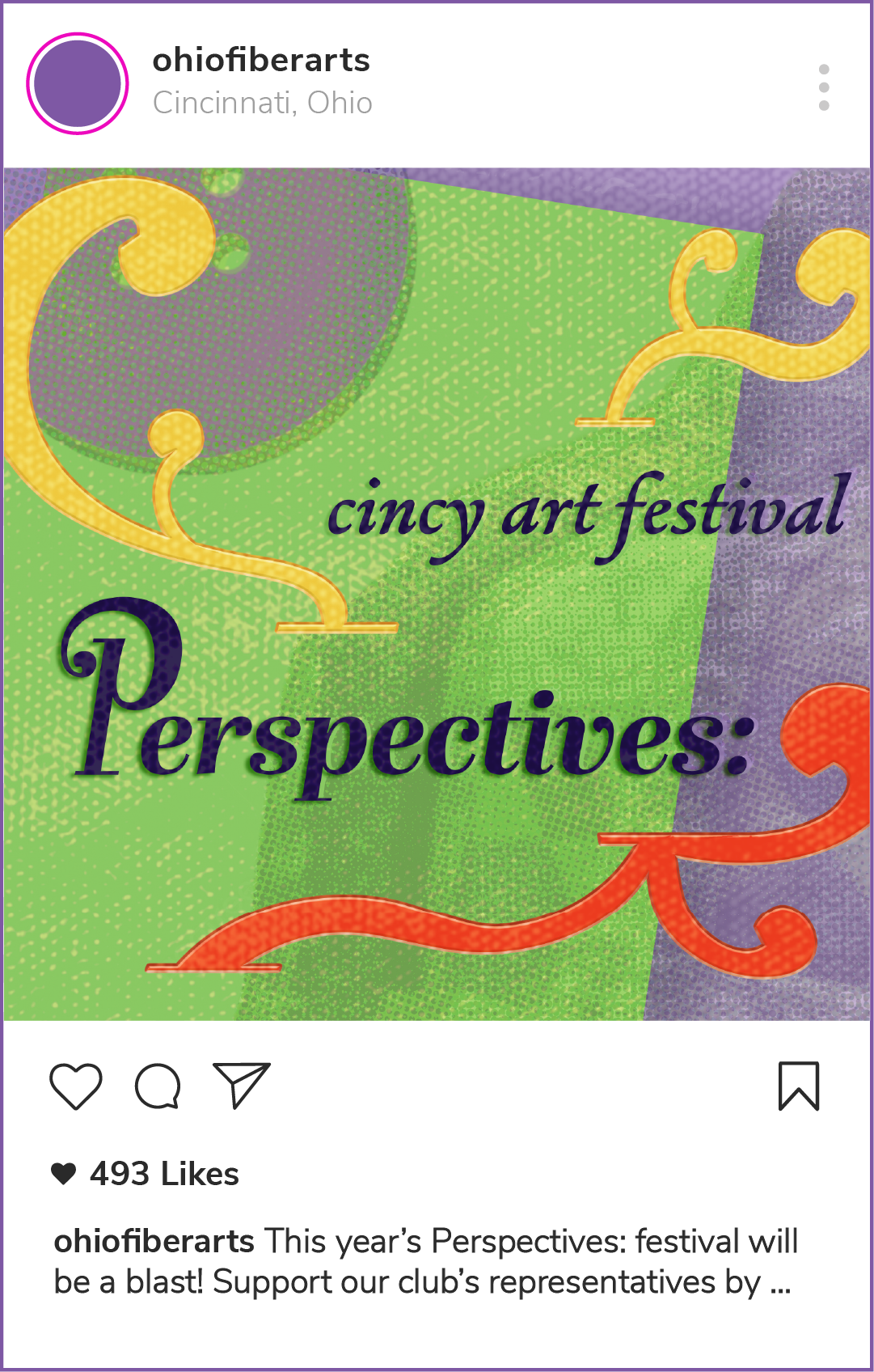
Composition 3: Fiber Arts
After color explorations, I took the file into photoshop to add texture and imagery, in order to further convey my message regarding the groups I am trying to reach. In my initial iterations of this, I incorporated textures found in each medium. (Canvas, clay, fabric, etc).
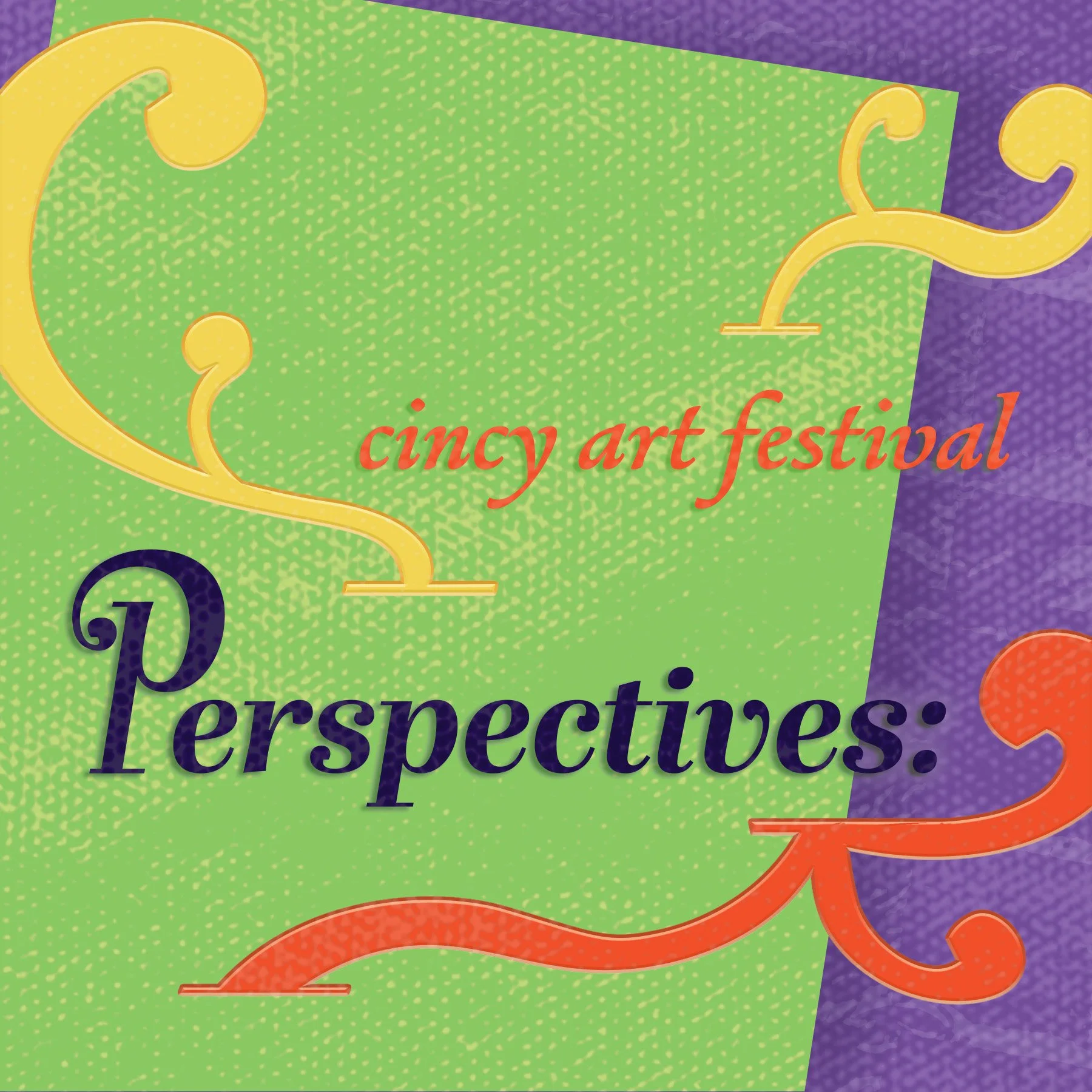
FINAL SOCIAL MEDIA POSTS
Through these iterations, I decided to utilize some imagery in order to better communicate my intended messages. For the fine arts post, a camera lens and paint palette. For the 3D mediums post, a ceramics piece and sculpture. Finally, I incorporated a quilt and a button into the fiber arts post.
ALL FINAL DESIGNS
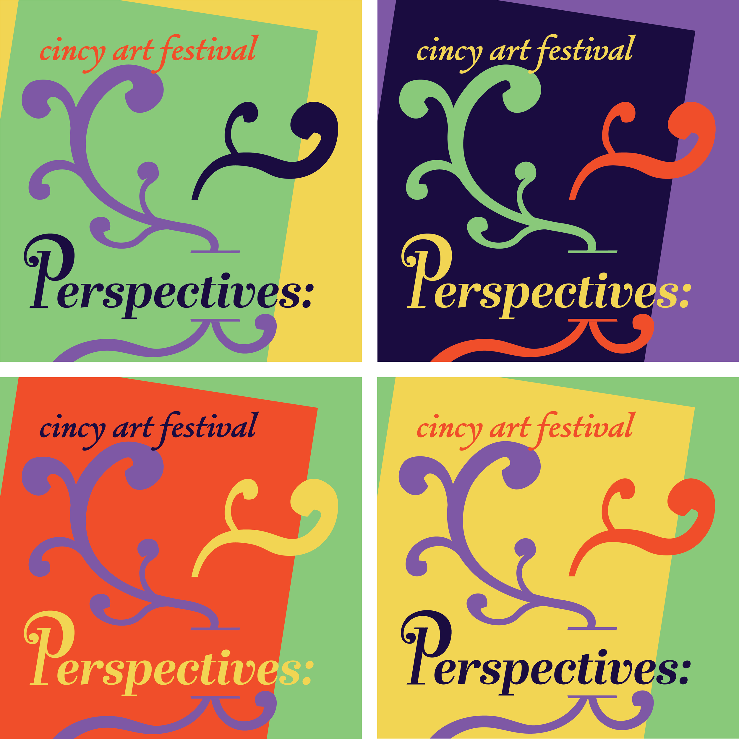
I decided to explore a few different color palette options, in the end I decided on the third one.
Composition 1: Fine Arts
Composition 2: 3D Mediums
These would be posted by local groups and clubs in order to promote our art festival!
Composition 3: Fiber Arts
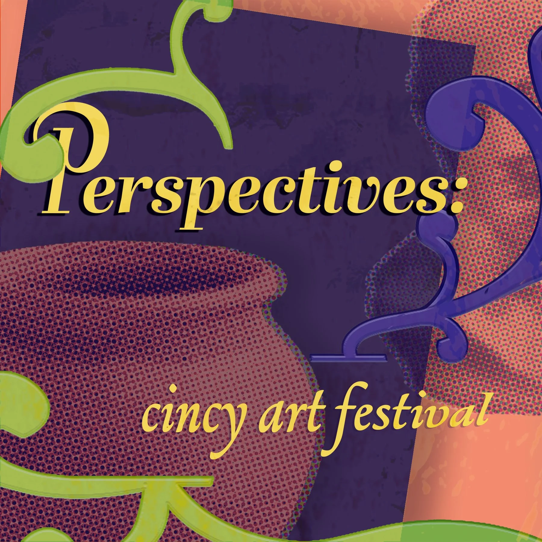
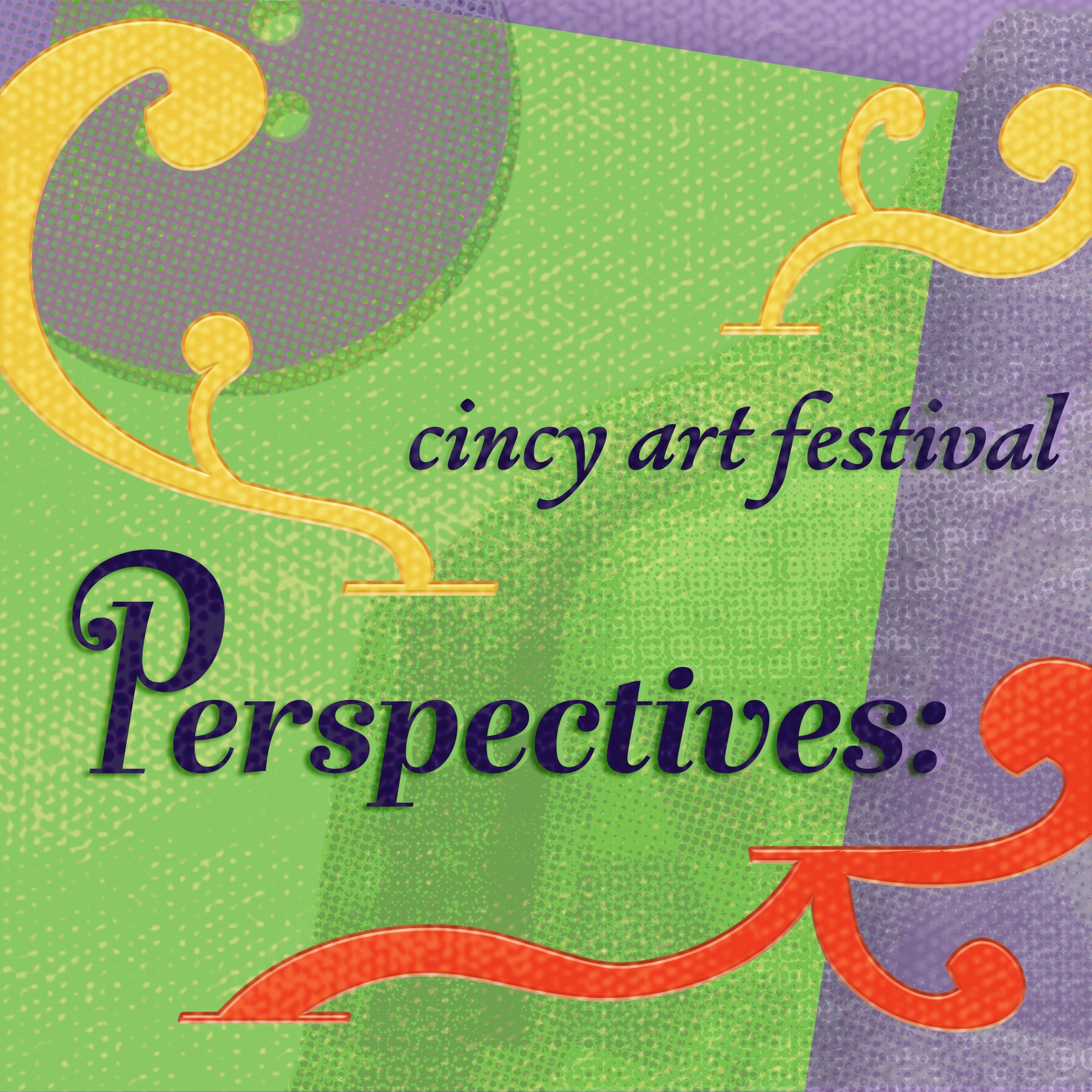
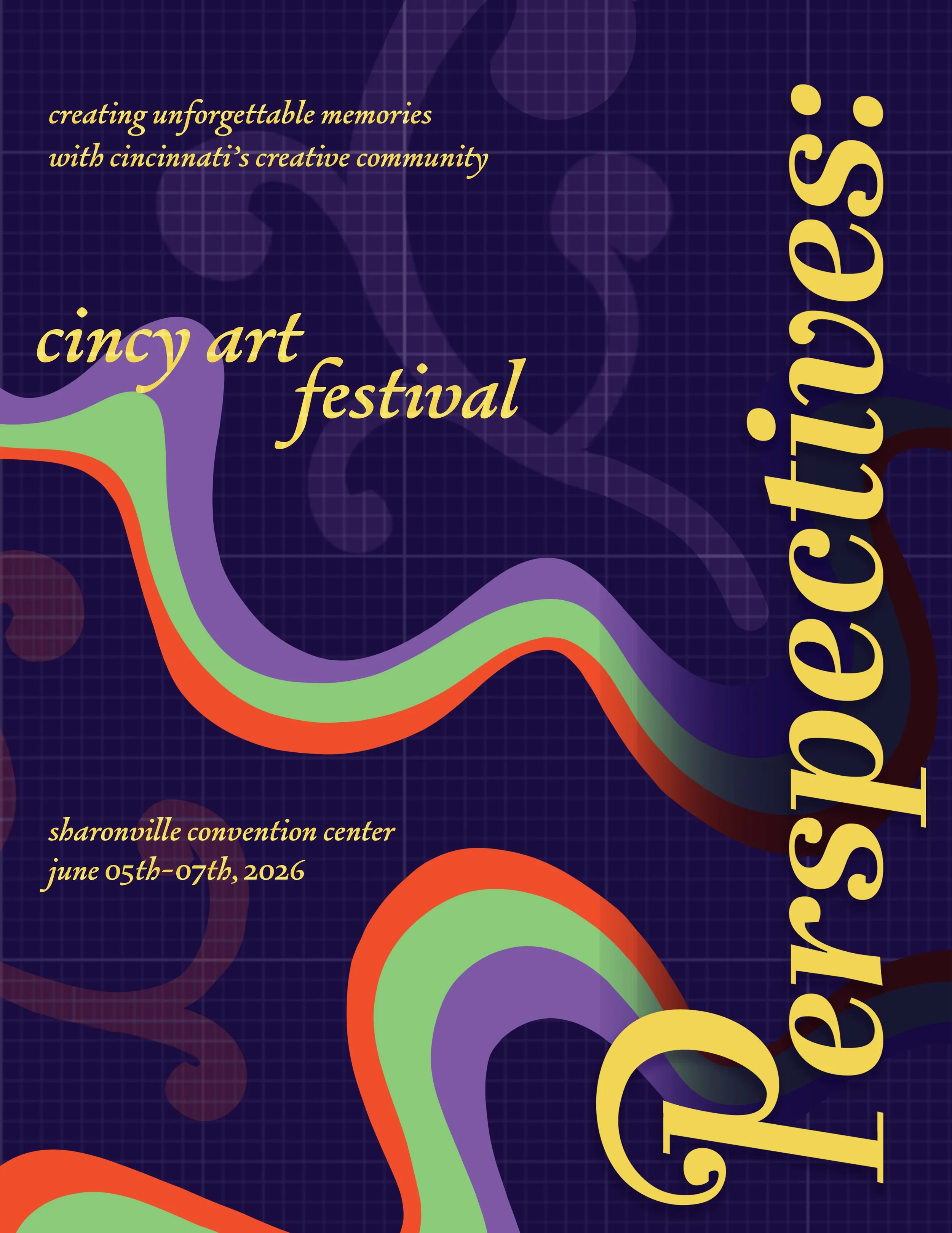
FINAL POSTER
POSTER PROCESS
Through a poster, the goal is to reach people in the local area by hanging them up in cities where people will walk by. I started with a few digital ideations, testing out layout and form language. I wanted the poster to be unique from the social posts, while still following the brand’s style guide.
After these, I decided I was straying too far from the brand’s staples. However, I took inspiration from some of the aspects included in these directions in order to create a new draft more aligned the established style.
Moving forward with all the ideas I’d compiled, I came up with the final poster design. For this, I decided to bring together the colors into one shape to depict a more unified, brought together community. Bringing together the “pieces” from the social posts.
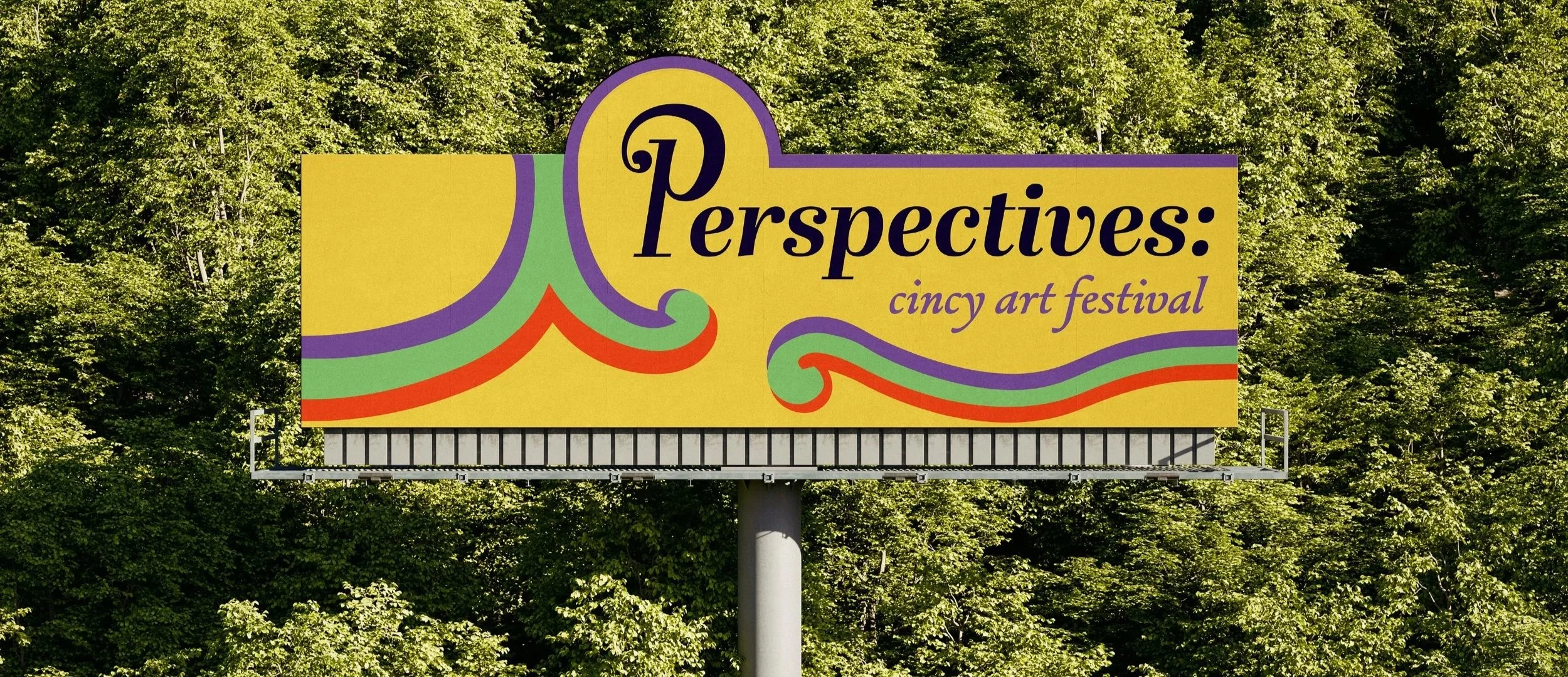
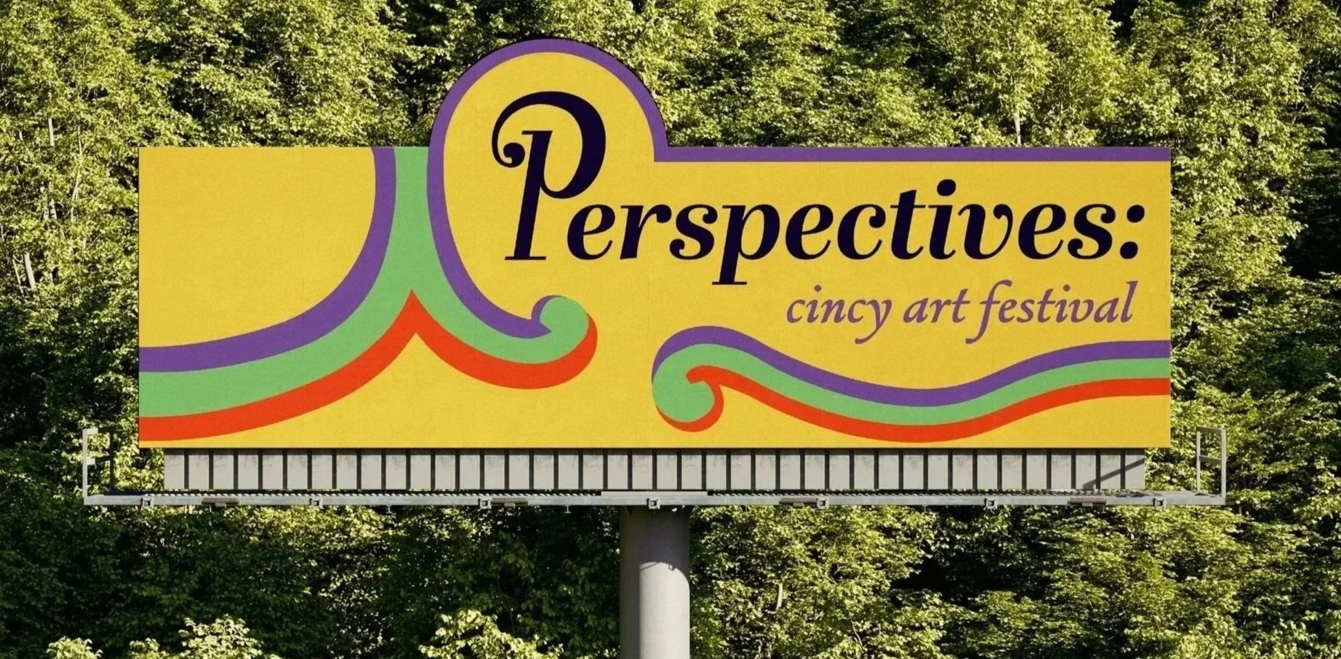
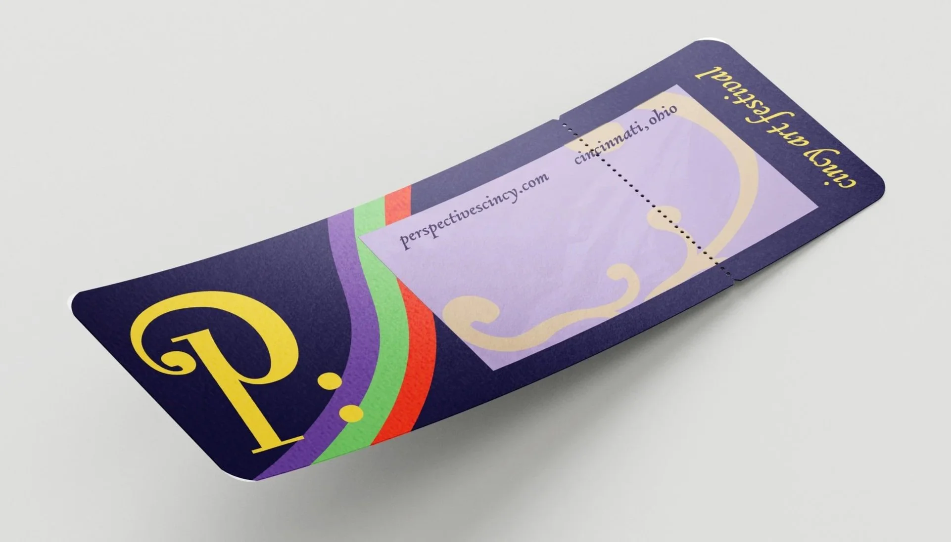
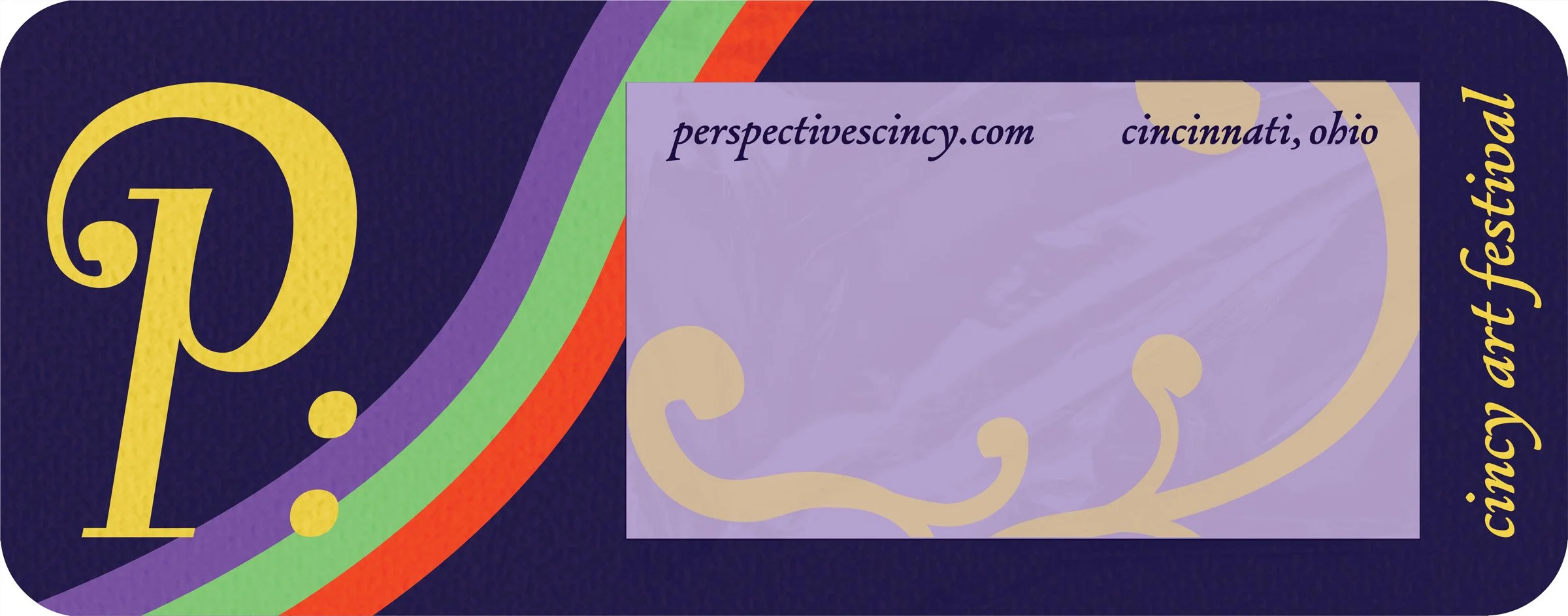
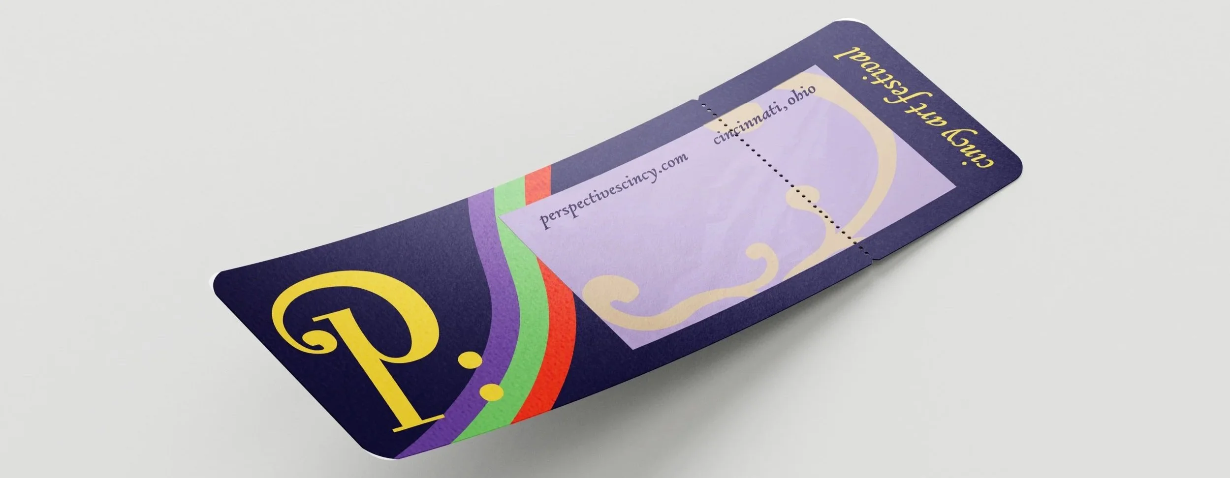
OTHER DESIGNED ELEMENTS
To further develop this brand, I created a billboard and ticket. The billboard advertises the event to local audiences, being a simple and bold design to make a quick impact. The ticket acts as a souvenir from the event, having a tinted plastic middle to “see the event through a new perspective”