
Informational Airport App—Spring 2025
Completion of designing separate screens of a mobile application for an airport, keeping type hierarchy in mind.
TYPEFACE EXPLORATION

I started off the project by looking for suitable typefaces for the application. I wanted one that had multiple font options, as well as being accessible and easy to read. I ended up choosing Novatica due to the high legibility with its wide letterforms.
STARTING ON FIGMA

To start on Figma, I chose an initial color palette and started ideating on individual interface parts.
SCREEN IDEATIONS


I continued on by exploring more color palettes and ideating on whole-screen compositions.
SCREEN REFINEMENTS


COLOR EXPLORATIONS


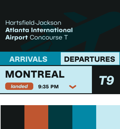


After getting a better idea of what I wanted the layout to be, I decided to explore some other color palette options. In the end, I stuck with a higher-contrast version of the original color palette.
FINAL LAYOUTS


